Media and Text Examples
Welcome to the Media and Text Widget Layout Library!
This page shows a variety of ways you can use the Media and Text widget to arrange images and text on a Basic Page in the Content Hub. If you’re looking for ideas, you can either scroll through the examples below or click on the scenario that best matches what you want to create.
Layout Examples
- Image + Text. A simple layout that works well for most content.
- Image + Text with Light Background. A great option when you want a softer visual style or a bit more separation from surrounding content.
- Image + Text with Dark Background. Use this sparingly. The dark background creates a strong visual contrast, so it can easily draw the user’s attention away from everything else on the page. Choose this option only when you want your Media and Text widget to really stand out.
Recommended Layout Scenarios
- 2 calls to action (CTAs) or profiles
- 3 calls to action or profiles
- 4 or more calls to action or profiles
A Note on How Many Widgets to Use
You can add as many Media and Text widgets as you like to a page. However, we recommend thinking carefully about how many you should include.
Choosing the right number depends on several factors, but the most important is cognitive load—how much information a user can comfortably take in at once.
A helpful question to ask yourself is: “What is the primary action I want the user to take on this page, and how many additional items can I include without distracting from that main goal?”
Keeping this in mind will help you create a page that feels clear, focused, and user-friendly.
Section without right column

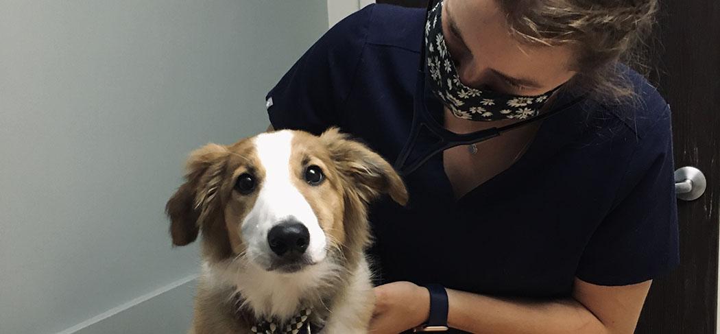
Display Size Small
This Media and Text widget has the following settings:
- Section Column: Primary
- Media Display Size: Small
- Media Alignment: None
- Background: None

Another person, also small
This Media and Text widget has the following settings:
- Section Column: Primary
- Media Display Size: Small
- Media Alignment: None
- Background: Light Blue

Display Size medium
Choose how large the media should appear relative to its text block. If no size is chosen and the Media and Text widget is not in a section, the media and text blocks will be equal width. To have the text block appear beneath the media instead, make sure the Media and Text widget is in a Section and, for Section Column, choose "Primary". Then either leave Media Display Size as "None" (for three images in a row on larger screens) or "Large" (for two images in a row).

Also Medium
Choose how large the media should appear relative to its text block. If no size is chosen and the Media and Text widget is not in a section, the media and text blocks will be equal width. To have the text block appear beneath the media instead, make sure the Media and Text widget is in a Section and, for Section Column, choose "Primary". Then either leave Media Display Size as "None" (for three images in a row on larger screens) or "Large" (for two images in a row).

Display Size Large
Choose how large the media should appear relative to its text block. If no size is chosen and the Media and Text widget is not in a section, the media and text blocks will be equal width. To have the text block appear beneath the media instead, make sure the Media and Text widget is in a Section and, for Section Column, choose "Primary". Then either leave Media Display Size as "None" (for three images in a row on larger screens) or "Large" (for two images in a row).

Also Large
Choose how large the media should appear relative to its text block. If no size is chosen and the Media and Text widget is not in a section, the media and text blocks will be equal width. To have the text block appear beneath the media instead, make sure the Media and Text widget is in a Section and, for Section Column, choose "Primary". Then either leave Media Display Size as "None" (for three images in a row on larger screens) or "Large" (for two images in a row).
This page shows you the different ways to use the Media and Text widget and the settings you need for each look.
Examples that span the full width of the web page:
- Small image with different background colours (none, light, dark)
- Medium image
- Large image
- Small image with light background
- Medium image with light background
- Large image with light background
- Small image with dark background
- Medium image with dark background
- Large image with dark background
Section with right column
Display Size Small
The Ontario Veterinary College (OVC) at the University of Guelph is a world leader in advancing veterinary medicine and health research to improve the health of animals, people, and our planet. OVC educates the next generation of health leaders and provides high-value experiential learning opportunities through an interdisciplinary, comparative approach aimed at finding real-world solutions to real-world problems.
Another person, also small
The Ontario Veterinary College (OVC) at the University of Guelph is a world leader in advancing veterinary medicine and health research to improve the health of animals, people, and our planet. OVC educates the next generation of health leaders and provides high-value experiential learning opportunities through an interdisciplinary, comparative approach aimed at finding real-world solutions to real-world problems.
Display Size medium
Choose how large the media should appear relative to its text block. If no size is chosen and the Media and Text widget is not in a section, the media and text blocks will be equal width. To have the text block appear beneath the media instead, make sure the Media and Text widget is in a Section and, for Section Column, choose "Primary". Then either leave Media Display Size as "None" (for three images in a row on larger screens) or "Large" (for two images in a row).
Also Medium
Choose how large the media should appear relative to its text block. If no size is chosen and the Media and Text widget is not in a section, the media and text blocks will be equal width. To have the text block appear beneath the media instead, make sure the Media and Text widget is in a Section and, for Section Column, choose "Primary". Then either leave Media Display Size as "None" (for three images in a row on larger screens) or "Large" (for two images in a row).
Display Size Large
Choose how large the media should appear relative to its text block. If no size is chosen and the Media and Text widget is not in a section, the media and text blocks will be equal width. To have the text block appear beneath the media instead, make sure the Media and Text widget is in a Section and, for Section Column, choose "Primary". Then either leave Media Display Size as "None" (for three images in a row on larger screens) or "Large" (for two images in a row).
Also Large
Choose how large the media should appear relative to its text block. If no size is chosen and the Media and Text widget is not in a section, the media and text blocks will be equal width. To have the text block appear beneath the media instead, make sure the Media and Text widget is in a Section and, for Section Column, choose "Primary". Then either leave Media Display Size as "None" (for three images in a row on larger screens) or "Large" (for two images in a row).
In Secondary Column
Whatever you select for "Media Display Size" has no effect if the Media and Text widget is in the Secondary/right column. The text will always appear underneath the image.
Another Section

Display Size None
This image is in a separate section with Media Display Size set to "None." Do this for several images in a row on large screens.
Display Size None
This image is in a separate section with Media Display Size set to "None." Do this for several images in a row on large screens.
Display Size None
This image is in a separate section with Media Display Size set to "None." Do this for several images in a row on large screens.
No Section
The four Media and Text widgets below are not in a section:
Media Display Size small
The Ontario Veterinary College (OVC) at the University of Guelph is a world leader in advancing veterinary medicine and health research to improve the health of animals, people, and our planet. OVC educates the next generation of health leaders and provides high-value experiential learning opportunities through an interdisciplinary, comparative approach aimed at finding real-world solutions to real-world problems.

Media and Text size Medium. Choose how large the media should appear relative to its text block. If no size is chosen and the Media and Text widget is not in a section, the media and text blocks will be equal width. To have the text block appear beneath the media instead, make sure the Media and Text widget is in a Section and, for Section Column, choose "Primary". Then either leave Media Display Size as "None" (for three images in a row on larger screens) or "Large" (for two images in a row).

Media Display Size Large
Let's test links
Here's a link within the text. It should pass color contrast checks. Some bold text and italic text. Below is a list:
- Item 1
- Item 2
- Item 3
Let's test button styles
Below are all the button styles available at the moment:
Media Display Size Large
Let's test links
Here's a link within the text. It should pass color contrast checks. Some bold text and italic text. Below is a list:
- Item 1
- Item 2
- Item 3
Let's test button styles
Below are all the button styles available at the moment:
Media Display Size Large
Let's test links
Here's a link within the text. It should pass color contrast checks. Some bold text and italic text. Below is a list:
- Item 1
- Item 2
- Item 3
Let's test button styles
Below are all the button styles available at the moment:

Media Display Size None. Choose how large the media should appear relative to its text block. If no size is chosen and the Media and Text widget is not in a section, the media and text blocks will be equal width. To have the text block appear beneath the media instead, make sure the Media and Text widget is in a Section and, for Section Column, choose "Primary". Then either leave Media Display Size as "None" (for three images in a row on larger screens) or "Large" (for two images in a row).
Video Test
Below is an example of how to put the image on the right - create a section widget, then add your text in the Primary column and the Media in the Secondary column. If you want them to be equal width, set Section Classes to col-md-6
Here's some text.

Testing https://youtu.be/Lj2O9OkBr3Q format
Test with more recent embed code.